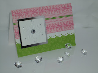
Firstly, i need to apologise as i know some people will be horrified that i am blogging a christmas card in June!!! I have been making some cards for Hobbycraft using the papers and dies they have sent (which have a christmas theme!!) I am really pleased with the card though! And as it had some lovley colours i thought it would be a good one to experiment with some different photos!


So here are my experimental photos!
I think the black is a little more forgiving with the light which i don't have a lot of in the craft room!!
I would really love to hear what you think of the photos!
The card was made using Anna Griffin Isabele papers and a embossing folder from the Sizzix "Winter Set" of embossing folders which I REALLY love!
Lisa xXx


7 comments:
I do like ... very much :) not only the card which is lovely (and Christmas can't come quick enough for me LOL) but I like the photographs too - I prefer the ones standing up right, I think.
Lovely card and photos Lisa. Prefer the black background .
Kath
Lovely card - the pink and green is so soft and fresh. I think they stand out best on the black background, myself.
lovely card - not too early for christmas, organised crafters start early, that doesn't include me unfortunately!
the photos are excellent - i prefer the black, the colours stand out more
looking forward to more of your gorgeous ideas and photos
I usually go for white background but I actually like the black here. The only difference for me is, that the black background gives the impression that the silver card outline is black! I prefer the card standing and the diamonds look better with the white background! *Ü* TFS. ~Glen~
The best one is the final white one with card standing up, I like the added diamonds, they look best in that photo as only 5 are visible instead of the 6 in the other photos. You should never use an even number, odd is always more pleasing to the eye.x
I like the white with the 5 diamonds that looks really good alma x
Post a Comment